Introduction
The SAOPP project is part of a larger, ongoing project. So this case study will grow over time. As mentioned in the summary, the project concerns the association for the protection of the rights of victims. By emphasizing empathy, the SAOPP project seeks to provide meaningful support for victims and offer a platform from which their voices can be heard.
Brand design
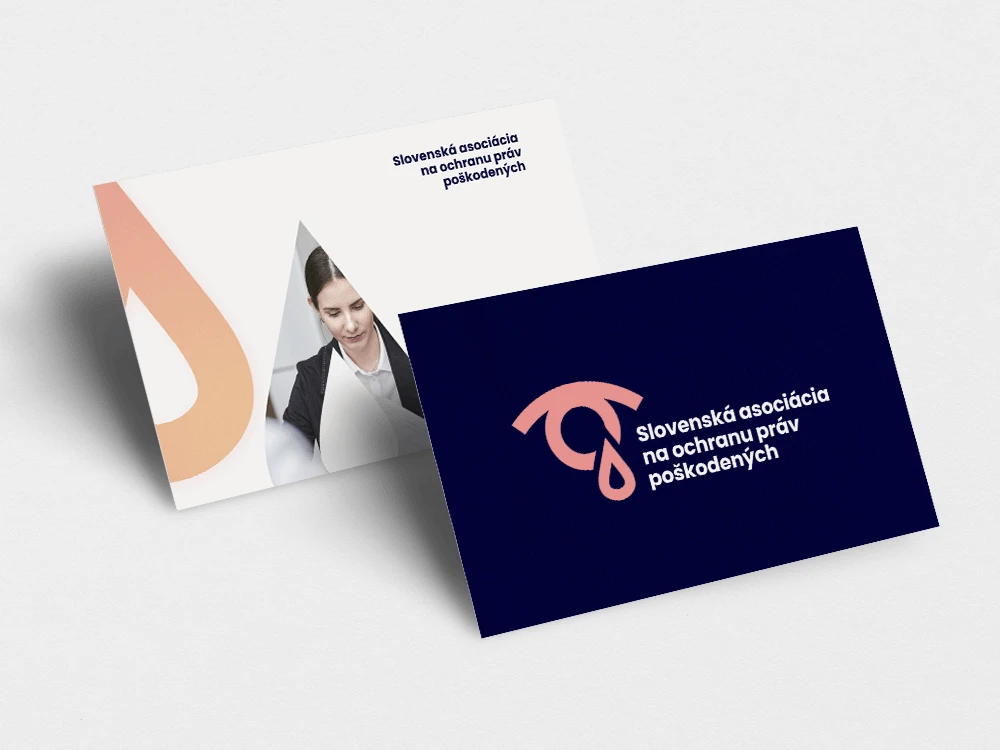
The symbol of the association became an eye with a tear, which represents compassion for those who cry. The color palette was chosen so that difficult topics such as death or serious injury could be communicated through it. At the same time, hope can be communicated by combining brighter, warmer colors with darker, colder colors, which serves as a reminder that even in times of despair, there is still hope for a better future.
Web design
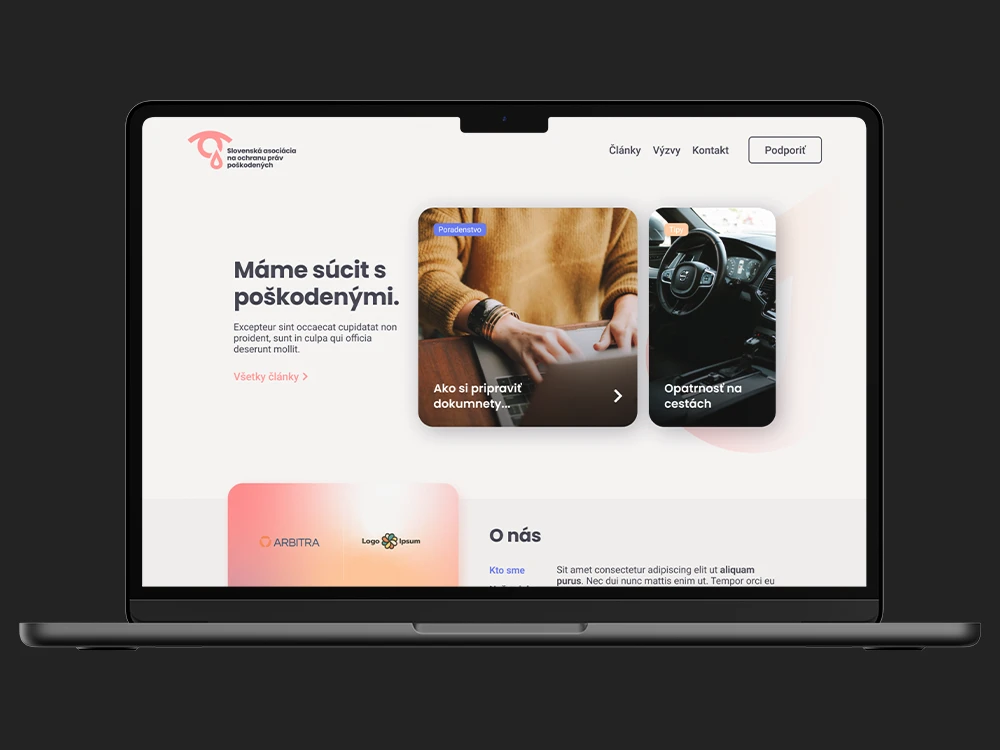
An important element of web design in this project was the hero section, in which the client wanted to display current articles. At the same time, he wanted the site to appear representative. So I designed a specific “hero” section that was tailored to display the articles in a more attractive and user-friendly way.