


Introduction
GoGerman is a German language school based in Zürich, Switzerland, founded by Renata Rafaj. The school provides German language classes to individuals and corporate clients, and it has grown rapidly since its inception. However, the school’s website has not been updated in several years, and the CEO, has recognized the importance of having an updated website, and the visual identity for the growth of the school.
Content analysis
After receiving a brief and access to the clients’ content library, I started with content analysis. The goal was to find bottlenecks that have the possibility of decreasing user experience or opportunities that I should take advantage of.
My findings:
- a lack of social proof, such as logos of partner companies or the number of students who have graduated from GoGerman school.
- missing clear copy explaining what makes the GoGerman program different from regular language school courses.
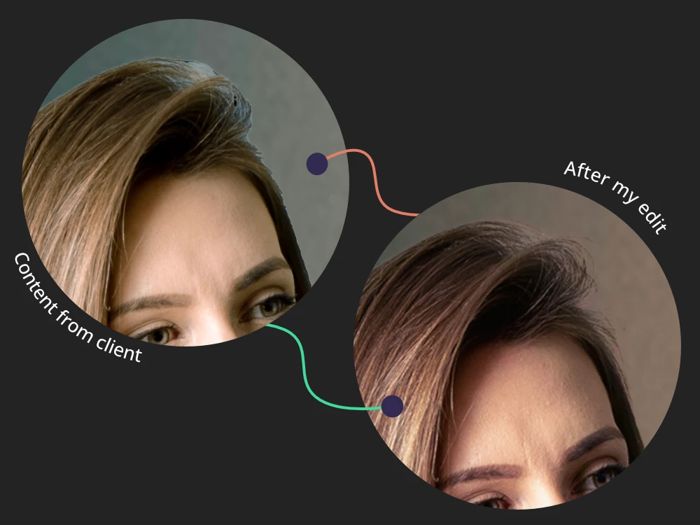
- poor quality of photo editing.
The findings of the analysis were discussed with the contractor. The client was instructed to supply the necessary texts and data. I took care of editing the provided photos.
Logo design
One of the reasons for the new visual identity was that the GoGerman logo felt like an elementary school logo to consumers. It was important for the CEO of the company to change this image since the vast majority of students are from a corporate environment.
The request was to keep the owl symbol in the logo, which has represented the school since its foundation. I depicted the owl in a simple, geometric style to appeal to tech employees seeking efficient foreign language learning.
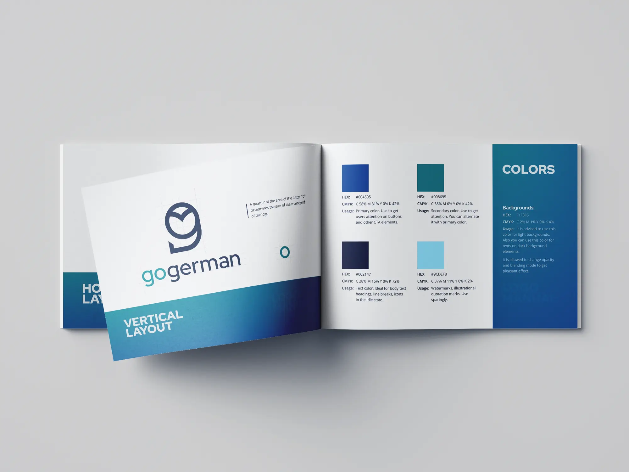
After the approval of the logo design, a logo manual was created, containing: the structure of the logo layout, safe zones, the definition of brand colors, and practical examples of the design.
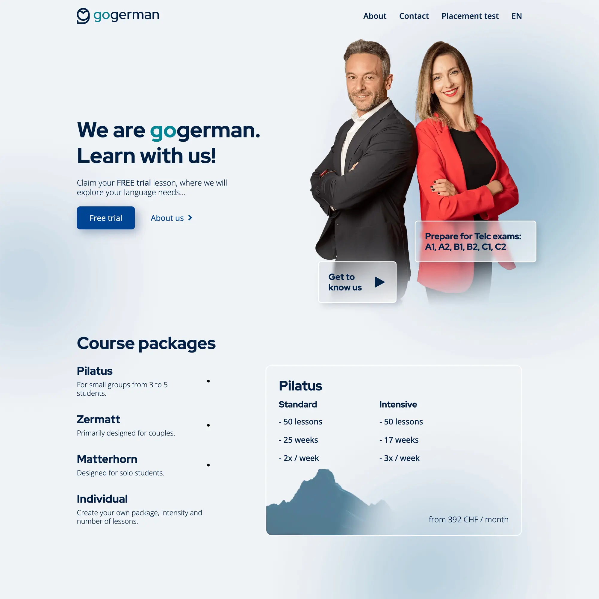
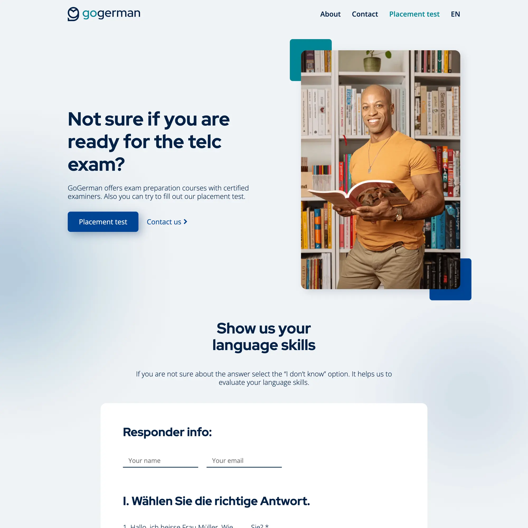
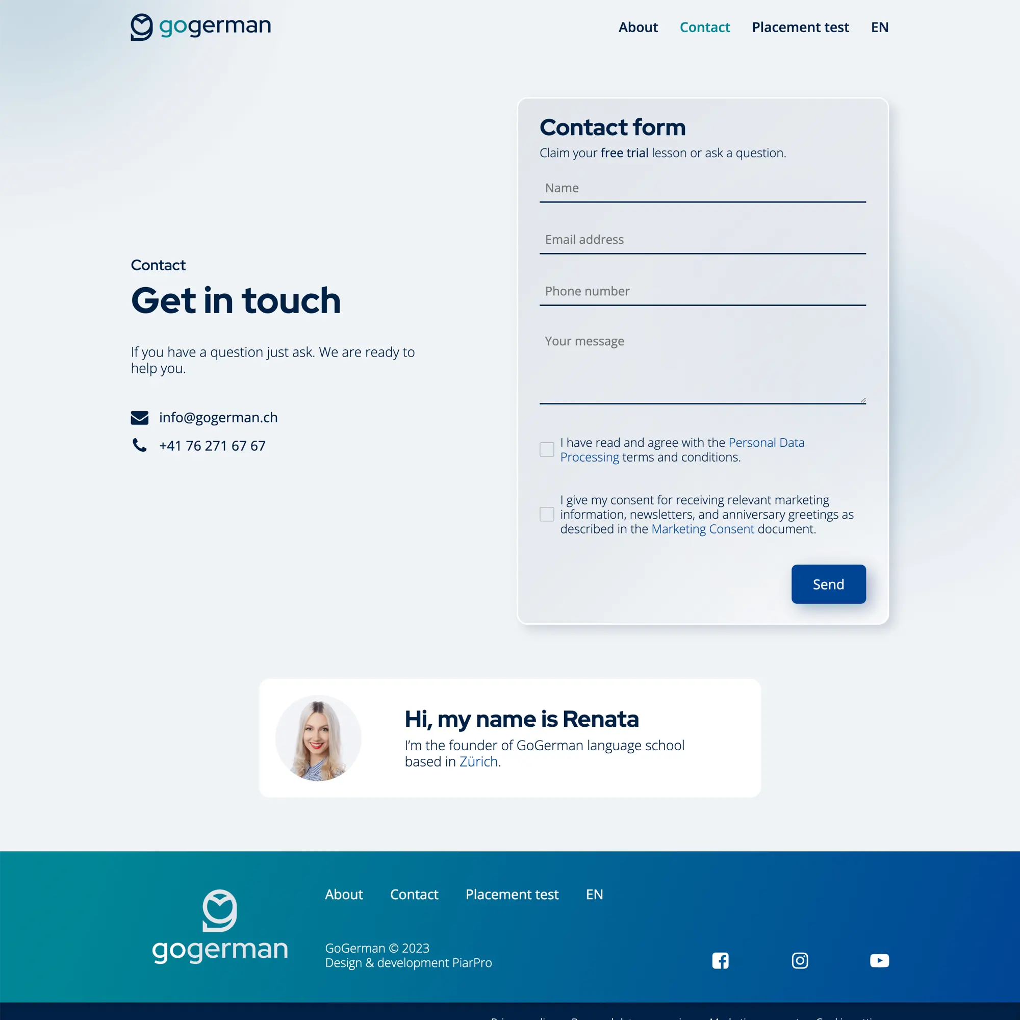
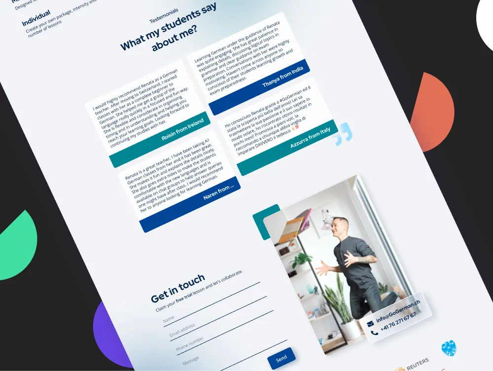
Web design
Taking into account the knowledge gained from the content and user analysis, a wireframe was designed that helped me present the new layout to the client. Then the preparation of individual design components for the web began, such as:
- hero section
- testimonial repeater
- contact forms
- CTA
- social proof section and banner
Conclusion
After the end of the design phase and the feedback rounds, I started with development on the WordPress platform. In addition to creating a custom template for the client, the CMS was also modified to make the content editor’s job easier.
The project was handed over to the client, who is already communicating under a fresh visual identity and is gaining clients thanks to the new website.
Liked this project?
There is no better way to familiarize yourself with a web design project than to see it and try it with your own eyes.
Show GoGerman